
I recently found myself needing to implement a table of contents-style effect to display information, first in formatting a restaurant menu and later in formatting a list of cast members. This solution uses HTML and CSS — no JavaScript needed. Keep reading for a step by step guide to implementing this styling on your own!
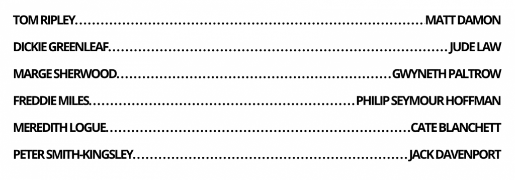
We’re going to work through creating the main cast list from The Talented Mr. Ripley as seen above.
Format your HTML using spans
- Close all of your content in a div container (
.castContainer). - Enclose both elements you intend to have on the same line in one div (
.actor). - Enclose each individual element in its own span tag (
<span>Tom Ripley</span>). - Insert an empty span with the class of “ellipses” between the two elements you intend to position on the same line (
<span class=”ellipses"></span>).
Using our example, we now have the following HTML code:
<div class="castContainer">
    <div class="actor">
        <span>Tom Ripley</span>
        <span class="ellipses"></span>
        <span>Matt Damon</span>
    </div>
    <div class="actor">
        <span>Dickie Greenleaf</span>
        <span class="ellipses"></span>
        <span>Jude Law</span>
    </div>
    ...
</div>
Style your content in CSS using flexbox and pseudo elements
- Style your div container and span as desired.
- Add
display:flexto the div enclosing each line. - Using
.ellipses::before, insert a long string of periods, which we will later clip to create the required length of ellipses between elements. - In order to allow the ellipses span to grow as required, while the text elements remain a consistent size, add
flex: 1 1 autoto the ellipses span andflex: 0 0 autoto the first and last child of the div enclosing each line. - To prevent the white space between periods from breaking the text on to a new line, add
white-space: nowrapto.ellipses. - Clip any extra periods using
overflow:hiddenandtext-overflow: clip.
In our example above, we now have the following CSS code:
.castContainer {
    width: 70%;
    text-align: center;
    margin: 20px auto;
    padding: 50px 100px;
}
.actor span {
    font-size: 2rem;
    font-family: 'Open Sans', sans-serif;
    letter-spacing: -2px;
    font-weight: bold;
    text-transform: uppercase;
    margin-top: 0;
    margin-bottom: 20px;
}
.actor {
    display: flex;
}
.ellipses::before {
    content: '. . . . . . . . . . . . . . . . . . . . . . . . . . .       . . . . . . . . . . . . . . . . . . . . . . . . . . . . . . . . . . . . . . . . . . . . . . . . . . . . . . . . . . . . . . . . . . . . . . . . . . . . . . . .';
}
.ellipses {
    flex: 1 1 auto;
    white-space: nowrap;
    overflow: hidden;
    text-overflow: clip;
}
.actor span:first-child, .actor span:last-child {
    flex: 0 0 auto;
}
As with most coding solutions, there are multiple ways to implement this type of formatting, but I’ve found this to be the most straightforward. Try it yourself!